Chaos Design
Why did we even invent computers in the first place?
“…These facts seemed to me to throw some light on the origin of species—that mystery of mysteries, as it has been called by one of our greatest philosophers
This excerpt is from the first paragraph in The Origin of Species. I’ve highlighted the word philosopher here because it’s easy to miss. But here is Charles Darwin giving a shout out to this unnamed person in the opening paragraph of his most seminal work.
It turns out, he was referring to this guy, Sir John Herschel.

In 1831 Herschel had authored A Preliminary Discourse on the Study of Natural Philosophy. A book that heavily influenced Darwin’s approach to science. So much so, in 1836 after 4 years of traveling on the HMS Beagle, Darwin wanted to do nothing more than visit Herschel in South Africa.
Herschel was living in South Africa drawing and cataloging plants with his wife, to get away from the fast paced London lifestyle of the early 1800’s he could no longer take.
Historians have noted how frustrating, that while Darwin kept a fairly detailed journal, there is no record that covers extensively what was discussed during their hillside chats.
What we do know, is that during their meeting “Herschel inspired Darwin to apply the critical analysis of data associated with the physical sciences to the emerging life sciences…” Herschel himself was an accomplished astronomer. His earlier writing influenced generations of scientists, Darwin included. Scientific historians have noted “…astronomy has historically led the way in the development of scientific methodology, later applied to other disciplines.” We think of science as being a mature discipline but in reality Biology didn’t become mature until the mid 19th century. So here is Herschel, urging Darwin to study and borrow methodologies from other disciplines to advance his own.
About a year after meeting with Herschel - Darwin drew this initial sketch, with the note “I think.”

23 years after their hillside chat, Darwin finally published the Origin of Species. Upon publishing, he sent a copy to Herschel with a note about Herschel’s influence on his work.
"...Scarcely anything in my life made so deep an impression on me: it made me wish to try to add my mite to the accumulated store of natural knowledge."
I think we could get some inspiration from this. How can we add something, even if it’s a small thing, to our accumulated store of design knowledge? What other disciplines can we learn from? Where can we apply their methodology to our work?

London in 1821 according to this painting
Now, it turns out this wasn’t the first time that Herschel had been involved in manifesting a big idea. 15 years prior in 1821, before he had retreated to South Africa, Herschel found himself sitting around a table in London with a friend, going over some tables of data. As one does with friends.
Now there were two things in particular and about these tables of data that were troublesome. First off, the numbers were wrong. Secondly, it took people a lot of manual time to produce all of these inaccurate calculations. After finding yet another error, in a moment of pure frustration Herschel’s friend exclaimed:
‘I wish to God these calculations had been executed by steam’
‘I think it’s possible’ replied Herschel
That friend, was Charles Babbage, the man who invented the concept of a digital programmable computer. Hard not to love how his concept of automation is centered around steam.
This drive to create the first computer was rooted in Babbage’s effort “to eliminate the risk of human error. The infallibility of machinery would eliminate the risk of error from calculation and transcription”. He saw the world how it was and saw a vision for a different world we could be living in.
It’s hard not to appreciate the significance around the fact Herschel was present and involved in the origin story of two fairly significant ideas within the arc of human knowledge. The modern computer, and the theory of evolution.
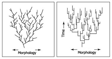
When we think about evolution we often think about this image. Or something like it.

And this isn’t wrong, but it doesn’t fully illustrate what’s going on either.
This is Darwin’s initial sketch again. While most depictions are linear, evolution is really a branching model and has been since the beginning.
It’s important to remember when we talk about evolution we aren’t necessarily talking about getting rid of things. Although that can and does happen.

Steam powered calculations was a really good idea. Good enough to catch the interest of a Count Ada Lovelace. She was the first person to recognize how powerful the idea could be if extended beyond just pure calculations. Together they pursued the design and construction of a programmable computer for years. Sadly their ideas didn’t evolve directly into the devices we know as computers. Their ideas died off. It wasn’t until after the computer was invented that their early ideas were recognized. It seems people didn’t have the same drive to fix spreadsheets that Babbage did.
194 years after this fateful event in London, which for reference is 41 years after the first personal computer, Paul Ford published a 40,000 word piece called What is Code. The first time I read it, one sentence in particular jumped off the page.
“One study by a researcher at the University of Hawaii found that 88 percent of spreadsheets contain errors.”
This sentence jumped off the page because I knew Babbage had wanted to fix the pesky problem of having errors in spreadsheets. 88%!? That seemed too high and I am skeptical. My curiosity was sparked. How important are these spreadsheets? How big are these errors? So I read Raymond Planko’s research paper from 1998 titled “What We Know About Spreadsheet Errors” which was featured in a special edition of “The Journal of End User Computing’s” on scaling up end user development.
TL;DR the errors are very big and the spreadsheets are from Fortune 500 companies.
This is a partial breakdown of errors from one spreadsheet
- 10 errors of $100,000
- 6 errors of $10+ million
- 1 error of $100+ million
The auditor comments are more amusing than you might expect.
”The investment’s value was overstated by 16%. Quite serious.”
“One omission error would have caused an error of more than a billion dollars.”
“Only significant errors”
I’m curious as to why we have not moved the needle on fixing spreadsheets. Maybe that’s because spreadsheets are really hard to fix. Maybe it’s easier to get a car to drive itself.

What would Babbage think? To see the wonders computers can do today contrasted with their failure to solve the original problem that frustrated him so.
I’m interested in this sentiment. Where are we spending lots of rote time doing calculations incorrectly? As someone who has spent a lot of time refactoring css, a few things quickly come to mind.
I want to revisit evolution, because part of what I’m here to speculate on with you is how things will evolve around us. In evolution phyletic gradualism is when change occurs ‘uniformly, slowly, and gradually.’.
The idea of punctuated equilibrium is the idea that evolution happens in rapid short bursts followed by periods of stasis. “When significant evolutionary change occurs, the theory proposes that it is generally restricted to rare and geologically rapid events of branching speciation called cladogenesis.”
 Phyletic Gradualism vs. Puncuated Equilibrium
I feel interface design has been at stasis for some time. It is hard to imagine over the next 20 years we are going to see a gradual advancement in how we do work. I’m observing a number of things that lead me to believe we are going to undergo a rapid burst of change. I suspect we might see a number of bursts in quick succession.
What are the environmental/industry forces that might produce rapid evolutionary change in how we work and design? As astronomy helped inform other disciplines in the 1800s. Where can our relatively new discipline of digital design learn from today?
We might start by taking a look at print
We’re here to talk about interface design. An interface can be defined as “a point where two systems, subjects, organizations, etc. meet and interact”
I’ve always thought about books as a point where an author and a reader can meet and interact. Books facilitate endless amounts of meetings across time and space. Cataloging an idea in a book can be such a powerful force, that it compels someone to sail from London to South Africa in 1836.
So, if we are to learn from books, we might find ourselves asking - how has printing evolved since its inception and where is it going now? In “A Short History of the Printed Word.” Warren Chappel describes what he calls the three phases of print.
The first phase
“It involves the carving of whole pages into flat wooden blocks, and thus treating the written text like any woodcut illustration”

This sounds like the first stage of many peoples design process. Thinking in pages. Or “large sections”. Makes sense as a starting point. It’s easy to wrap your head around a page. It is easy to have a meeting to look at “a page”. How many of you have ever created (or received) a design spec for an entire page to implement? How many of you have worked this way in the last 5 years? 2 years? 1 year? Last month? Will we look back on this as an ineffecient way to work?
The second phase
“The second phase depends on the carving and casting of individual letters or characters. Once these units of visible language have been cast in multiple copies, they can be endlessly assembled, disassembled, and reassembled into an infinite number of texts. That is what is meant by movable type.”

Icons, Colors, and Typography


Type-scale documention for BassCSS and Bootstrap
It feels like we are collectively emerging into this second phase right now. The past decade has seen a proliferation of design systems and component libraries for the web. We’ve seen atomic/functional/oocss patterns go from gasp inducing horror shows, to the forefront of best practices.
These collections are comprised of smaller pieces that can be cast in a multitude of copies. Saying movable type was a really big deal is an understatment. It should be noted, I am not implying that the advent of atomic/functional css is as culturally significant as the creation and adoption of movable type. I’m mostly interested in the parallels in workflows and mental models. Even though these evolutions of are happening more than 1,000 years apart - there are stark similarities.
 Rebass: A popular react component library
 Lightning Design System
 Ant Component Library
We see similar abstractions that are emerging. Spacing. Typography. Color. These can be used across components, pages, or even entire projects. These elements can be combined endlessly to produce a wide array of designs. The invention of movable type didn’t inherently make the writing in books better. And it’s important to note a new css or component architecture is not going to magically improve the quality of our interface design. But it can have far reaching effects in lowering the barrier of entry for access, giving us more people to help solve some of these problems. What will these systems look like once they are more mature? What about a world where every component is already made (possible)? What types of problems will we have then?
While there has been a lot of movement into this direction - we still lack the level of composability found in other disciplines.
 Starting screen of Mixamo
Demo of uploading a 3d charachter and seamlessly composing fully configurable animations on top
Could we use computers to automate this transition from phase 1 to phase 2? In some ways I think css in js solves this problem. Allowing people to attach any amount of styles to an element or component, just to have them split up into single purpose classes and reduced to the smallest code footprint that renders the fastest.
But what about auditing the visual history of the web? How much can we learn from static css files? Using the Internet archives wayback machine and the css stats cli, we could download the history of a site and visualize how values change over time. Most companies have several websites with different front end codebases. What if could easily visualize all values across sites? And find where we are using common values?
Padding and margin changing over timeThe third phase
“The third phase has only just begun, but clearly it involves another fundamental shift. In this phase, texts and scripts alike are electronically described in forms that can be stored, transmitted, edited and printed at high speed, on complex but small devices…”
Digital interfaces allow for a fluidity to the printed word that is relatively new. In the past, you might spend 10-15 minutes picking a typeface and font size in Microsoft word in preparation for printing it out and sharing with others. But when you publish on Twitter, Facebook, Medium, you’re removed from this part of the design process. Even to your own website, you don’t have absolute control over how the typography will render for the end user. As your content will be consumed on multiple clients and devices. Set in serif, sans-serif, large, normal, or small.


The user is able to configure a few basic things to choose between hundreds of designs. If they are looking at it in Safari they might just hit the reader button. Gone are your custom selected web fonts, your colors, your visual brand. Personally I love this. I think users should be able to seamlessly bounce between how we have decorated our home if they want to visit, while also allowing them to adorn our content in their own comforts.


If we peer through the proper lens we’ll find this constraint, in this context, can be quite liberating. What can we do when we only need to think about content.
So what is our third phase? Will we start to enter it before we’ve finished entering the second? While Chappel has defined three phases in print, that doesn’t mean we have the same limits. How many phases and shifts will we have?
When I contemplate the future of humans interacting with computers, I’m consistently drawn to this quote from JCR Licklider:
“It can allow a decision maker to do almost nothing but decision making, instead of processing data to get into position to make the decision.”
That sounds like a quite the dream. But it also sounds foreign to how I interact with a computer. I find myself and my teammates, even against our best efforts, performing a lot of rote tasks, in an effort to get to a point where we can make a decision. And even then we aren’t always successful in that task. While Babbage was the originator of the concept of the computer - JCR Licklider was certainly one of it’s most influential visionaries. It’s hard to come across much early computer work that wasn’t influenced by his thinking. Again - I wonder what Licklider would think about the current state of affairs. Computers no doubt can do AMAZING things. But does it feel like we are living up to our potential? Are we essentially driving a bunch of Ferraris around in 2nd gear?
I find that both building and designing is a constant cycle of having a question and trying to find the answer. When you have a question, the more steps/time involved to see something rendered that might answer that question, the slower your feedback loop.
In my opinion, feedback loops for interface design seem unreasonably long. How fast and short can we make our feedback loops? Where are we missing critical feedback loops in our process? Which wheels are we unnecessarily inventing over and over again? As Alan Kay says, where are we reinventing flat tires?


When you change something (code or design) you want instant feedback on the effect it will take in all possible contexts. If you know how you are affecting a system, the less likely you are to break it.
 Walt Disney Concert Hall
Often times when we break an interface we’re breaking the things we can’t visualize during the development process. So what types of tools or processes can we create to augment this flow?
“You either see it in your tooling, or you see it in a bug report. And it’s a lot more expensive when you see it in a bug report.” - James Culveyhouse
I love this quote.
So what’s it like to be good at interface design in 2019? As far as I understand it’s pretty easy. You just need to make sure you get this simple checklist done.
- Loads instantly
- 60fps
- Usable with a keyboard
- Screenreader friendly
- Accessible contrast
- Award winning content
- Semantic HTML
- Works on the following screen sizes: All of them, also watches
- Works well in low light environment
- Works well in a bright light environment
- Supports right to left text
- No scroll jank
- Handles variable length content
- Works if CSS doesn't load
- Works if JS doesn't load
- Well balanced if user has different zoom level
- Looks amazing
- Has proper error states
- Only use design system
- Hover state
- Active state
- Focus state
- Loading state
- Empty state
- Easy to use navigation
- No superfluous animations and handles reduce motion
- Consistent with other parts of interface
- Follows all of the fundamental UI patterns
- 100% accessible, no bugs
- Everything is fully documented
- Make it pop
Now this isn’t the fun type of checklist that you can breeze through in a linear fashion. Sometimes fixing something in one place, reduces the quality of some other tracked metric elsewhere. We’ve talked about some high level concepts and identified a few potential problems we could try to get computers to assist us in solving. And now it’s time to look around at some other methodologies we might be able to make use of or draw inspiration from.
Let’s start by taking a look to some of our system engineering friends and what they’ve been up to recently with Chaos Engineering.
Chaos Engineering is…
The discipline of experimenting on a system in order to build confidence in the system’s capability to withstand turbulent conditions in production.
To make their systems stronger companies like Netflix, intentionally break services on production randomly. They wanted to “move from a development model that assumed no breakdowns, to a model where breakdowns were considered to be inevitable.” The thinking is that people will build better systems if they know failure is guaranteed to happen. Netflix found this created alignment around ‘redundancy and process automation to survive such incidents’. What if we applied this thinking to how we build and design components and interfaces? What if we considered the states a user might experience our interface as an incident we’re trying to survive.
What if we had… Chaos Design
The discipline of experimenting on a component in order to build confidence in the components capability to withstand turbulent conditions in production.
Chaos design in practice. If we were to reword the above a bit. We might come up with something like:
To specifically address the uncertainty of distributed components at scale, Chaos Design can be thought of as the facilitation of experiments to uncover weaknesses in a components implementation or design. Define a ‘steady state’ as some measurable output of a component that indicates normal behavior. Hypothesize that this steady state will continue in both the control group and the experimental group.
The harder it is to disrupt the steady state, the more confidence we have in the behavior of the system. If a weakness is uncovered, we now have a target for improvement before that behavior manifests in the system at large.
To design stronger and more resilient systems, it can be necessary to spend the majority of your time working outside of the ideal state happy path that contains the perfect set of data. You know. Meeting design stuff. Where everything magically works.
Think of every characteristic of an interface you depend on to not ‘fail’ for your design to ‘work.’ Now imagine if these services were randomly ‘failing’ constantly during your design process. How might we design differently? How would our workflows and priorities change?
Here’s a potential list of things we might be relying on
- CSS doesn't load
- JS fails to load
- CSS and JS fail to load
- Network speed
- Language / Variable content
- Left to Right text
- Presence of content (non-empty state)
- Length of data
- Data cleanliness
- Size of viewport
- Luminosity is low
- Ambient light is too bright
- Particular rendering engine
- :hover states
- Sight
- Mouse usage
- Business logic
- Permissions
- Plan level
- Quotas
- Network is online and transmitting data
When thinking about how to design around a world where we can’t rely on these services ‘not failing’ how might we change the way we work? The difference to chaos engineering is that we can’t flip these switches on production. These are actual things happening on production all of the time! So how do we get our development environment to reflect the environments the component will actually encounter. The turbulence of production?
Let’s envision what a chaos design environment might look like.
What if for a three hour period the ability to use a mouse or trackpad is disabled? What might happen? Would we spend that time making keyboard navigation better so that we can keep working on our design? If you’re working on a modal and you can only launch it by clicking a button, you must fix the keyboard navigation to get back to the intended work.
What if your screen didn’t render anything for 4 hours and the only way to interact with the interface was with a screenreader?

What if our interfaces were thrown into color blind mode simulating one of the ways 12% of the population perceives color for a day at a time? Would we design higher contrast interfaces that didn’t rely on people perceiving green to know something is “good” or “positive”?

What if for random 1 to 2 hour intervals your display only showed the mobile version - or what it looked like on a large display? Or both at the same time. Would our components be more responsive? Would they be more suited for the ergonomics of each device size?
What if for 1 day a week your interface only showed text in French? On average French is 20-30% longer than English. Would our interfaces be less likely to break with variable content?
What if for random 1 to 2 hour intervals your interface only showed right to left text? Would our interfaces be more global?
Demo of component development environment at CloudflareWe could even drive all of the probabilities for our chaos design system by data collected in the real world. Instead of spending 80% of your time designing on a hi resolution 27” screen, maybe the screen size your component renders to could match the frequency of real world usage.
This might sound like an awful way of working - as you lose a lot of control. But this does reflect the reality of the turbulence of production as we described before. And we might design stronger systems because of it. We haven’t found the discipline collectively to solve these problems by accident.
A lot of what we are talking about - are universal problems we all have in development and that all of our customers have in production. Things we could build tooling for as a community. Within our own businesses, there are a variety of states that we don’t account for by default as well. Empty states. Different user permissions. Randomly populating our interfaces with content of the shortest and longest lengths we have stored in a database. Within enterprise software we often have users with different tier plans. Or different limits, quotas, and seats. And when we build UI are we building systems to think through these states we know will happen? Why does it seem smoothly handling empty states is the exception not the rule?


View of github.com at various screen sizes
”The thought of every age is reflected in its technique.” - Norbert Wiener
Are we collectively happy with how our thoughts are manifesting as technique?
Stasis
Anyone recognize this component?

The classic color picker. Now we as humans, have been making color pickers for decades.
 Color pickers from 1999 and 2019
For the most part we keep building the same thing with the same functionality. Personally I think it’s weird that the default state of a color picker is “here is every color imaginable there are more than 16 million take your time.”
What if instead of spending time designing and building all of these color pickers that are all the same… we tried to make a better color picker. What types of feedback loops might we actually want in a color picker?
Demo of Kevin Gutowskis Contrast & Color PickerWe might want to know instantly about contrast. What is the current contrast with black and white for the selected color? As we generally design against a background of white, light gray, dark gray, or black. Even that might be a useful feedback loop.
- What about showing what the current colors will look like for people who are color blind?
- If we have a document palette - what if we exposed all the current accessible colors with what’s currently highlighted?
- If we do select a color - what if other popular colors to pair it with were suggested?
- What if the color picker only showed colors that aren’t currently being used on the web?
Given any two colors - we don’t have a vector for determining if it’s aesthetically pleasing. Or what kind of aesthetic it is. But what if we did track that kind of data?

This screenshot is from a project called RandomA11y
It generates random pairs of accessible colors. And we wondered - what if people were able to vote? Could we train computers to get better at understanding how colors relate to each other? If this is something we can compute - could our UIs be even more dynamic and offload color as a user preference? Is this another way we can give control back to the user?
And what if this was an API that others could consume?
    "combos":256319,

    "votes":256630,

    "votes_per_combo":0.9987881385652496,

    "up_votes":130529,

    "down_votes":126101,

    "latest_20": [

        "id":256496,

        "color_one":"#555ef9",

        "color_two":"#f3fde6",

        "created_at":"2019-06-10T15:49:37.058Z",

        "updated_at":"2019-06-10T15:49:37.058Z",

        "contrast": "8.41"

      ]
You could connect these types of apis to any design tool to improve feedback loops within color pickers or color palette generators. Read more about the API here
Living on the Edge
Edge computing is opening up a lot of new paths for us to affect interfaces. At Cloudflare we’ve got a product called Workers that allows you to write javascript at the edge. On the design team, we’re interested in how we can make it easier to augment the view layer.
When we load the site into this tool, we extract all the colors in the html and css, and show them along the top, alowing them to be customised and previewed. When you press deploy, we deploy a new worker script with new mappings — “change #efefef to #cc23ef”
We wouldn’t have to limit this to just color. We make any changes to themes and have our designs normalized against scales. Imagine the potential for a brand update - where you can just have all of the nearest colors updated automatically across all of your properties?
You could imagine the ability to start augmenting your web page in interesting ways. In 3d design and photography you affect the color, not just by changing the color of the materials and surfaces, but by applying light from multiple directions with different types of filters. You could affect the theme of your interface based on the calulation of current time and where the light source would be.
Demo courtesty of @winkervsbecks
What else can we learn together? What other types of information can we make available to each other and contribute to our collective knowledge? These aren’t trade secrets. It’s not a zero sum game. We share information now! But we do it at a small scale with slow feedback loops.
Besides just two colors - what can we learn about how different visual properties relate to each other? This is part of why John Otanderstarted to build Components AI
What can we actually track over time about how values and combinations of properties relate to each other? For us it’s a natural extension of Random A11y

The above is a long list of properties in css. But it’s not that long if you are a computer. On top of that - many of these properties are not needed when styling an element. When I’m styling a button, I don’t expect to use volume. Or page-break. Or a number of other properties. So what if we documented what we know so far about styling components. And created open templates for common components? Where design now becomes configuring an obvious set of properties, instead of needing to guess and declare.
The goal is not to eliminate options, it’s to narrow focus on the essential, allowing for expansion and exploration if necessary.
This idea of defining a component API has benefits extending beyond just these types of interfaces. Can we leverage teaching a computer what a button looks like in creative ways? Imagine having a design query language where you could ask to see all of the unique table styles in your app. Or all of the error states. Currently to do these types of audits, it takes a lot of rote work - and is likely to be outdated the week after it’s finished.
 Collection of buttons from a single company
What if you controlled inputs for a generative component design tool by deciding if you wanted to use the most popular or the least used values?
Interface from sliding through scales constructed from scraped css. Demo available here
Continuing to look elsewhere
If we take a look at what people are doing with machine learning, it’s hard to not be intrigued by reinforcement learning.
”Reinforcement learning is trial and error at a vast scale”

From How to teach AI to play Games: Deep Reinforcement Learning
There are people trying to train computers on how to beat video games. And they are getting pretty good. Which is probably worth a whole talk in itself. Now training computers to beat video games seems like a pretty obvious thing the first time you see it. The first time I saw a demo of it in practice though - this is the image that flashed in my head.
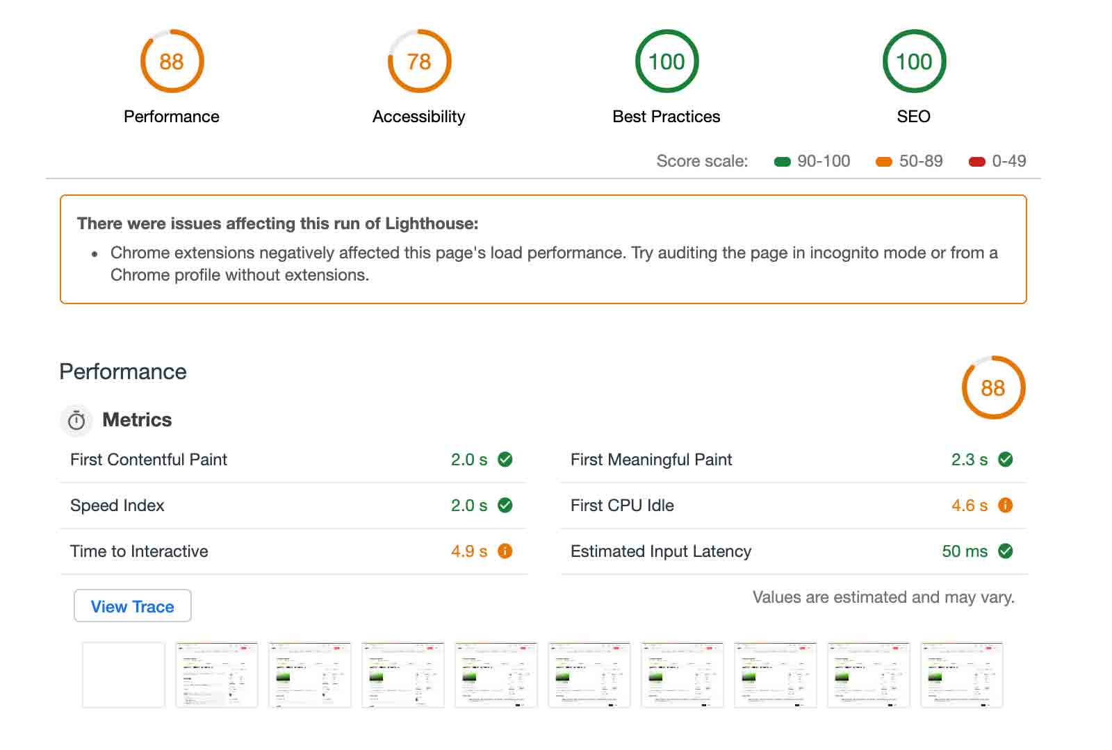 Screenshot of Lighthouse, a popular auditing tool for sites
What’s our workflow when we when we are trying to optimize something on the web? Running a lighthouse audit takes ~10-60 seconds to run. We check to see if the numbers have gone up or down. We make some adjustments. We re-run the lighthouse audit. And we check to see if the numbers go up or down. Now you might be using something else to audit your code. But the workflow is probably similar. This workflow is ripe for distractions. Computers don’t need to stop to check their email. Or reply to a ping in chat. This is the type of work that I just have a feeling computers are better suited for. Figuring out implementation details. Here we have a desired outcome. Four 100s. There’s compelling work being done right now that is going to make this type of work even easier for a computer to do.
Now this is emerging work now - but imagine where we’ll be in 101 years!
So what will the life of an interface designer be like in the year 2120? or 2121 even? A nice round 300 years after Babbage first had the idea of calculations being executed by steam.
“…back/neck/wrist strain will live in the past because I’ll be designing in a dimly lit room, in an inversion chair using mostly voice and gestural cues to control design software.” - Lauren LoPrete
The first time I saw this video I could feel the paradigm shift.
It’s from a study referenced in last years article titled The Surprising Creativity of Digital Evolution: A Collection of Anecdotes from the Evolutionary Computation and Artificial Life Research Communities
In it the constraint is that the grip has been disabled, but the crane is still able to grab ahold of the ball and move it between any two points. Will we learn to apply this type of optimization learning to interface design?
My mind wonders at the creative solutions computers might come up with to get a website to be fully responsive, performant, and accessible.
Project Dreamcatcher is a generative design project at Autodesk. They’ve started to incorporate some of that technology into other products and the industrial design industry is already seeing real world results. This is a tool that people use overhead, so weight is a primary concern. But they also have a constraint that it can’t be any weaker. With this problem and constraint, they were able to use generative design to shave off 3 pounds. That’s a 60% reduction in weight.
 Redesigned component
IT’S NOT BRUTE FORCE ENGINEERING. IT’S ELEGANT. YOU DEFINE A PROBLEM AND YOU GET A SOLUTION SET UNLIKE ANYTHING YOU’D PREDICT.
- Frank DeSantis, Vice President of the Breakthrough Innovation
How could we develop a language where we design interfaces by defining contraints and desired outcomes?
Future of interface design
So I’ve talked about how hard it is to be good here. But here’s the thing - this is the least amount of stuff we are ever going to need to worry about. Interfaces are going to get more and more complex. The likelihood of people sitting at a desk in front of two 27” monitors is incomprehensible to me.
Like the third phase in print, I think much of our work will be augmented by the user. We see small scale emerging hints at this with dark mode options, theming controls at os level. A new media query for what avatar shape users prefer. We open up these small options because no matter which one you choose the interface designers think it’s good. But these are incredibly small sets of options if we were to calculate how many fully usable designs the user could pick from. The more we understand how things relate to each other - we can offer up more options with great confidence.
 There are 128 combinations of color based theming options from curated values


My best guess is it we will see augmented reality usage grow the most in the immediate future. As AR and VR become more prevalent, will interface design largely be world building?
Will we interact with computers and machines by moving our body in expressive ways to manipulate our virtual environment?
 Gods & Monsters / Ubisoft
Regardless of what the future brings, our problem space is growing every single day. And we need better feedback loops to handle the increasing amount of chaos. I’m pretty sure robots won’t be taking away our jobs. But I do think they will take away some of our current work. I’m excited about that future though. I imagine we will spend more and more time defining a desired output with what our constraints are.
If you’re an ad agency - maybe web performance is important but maybe not the MOST important thing. Maybe you’re willing to have a 2mb website for the added pay off of high definition visual shine. For many businesses - you don’t need anywhere near 1mb to serve up a page that will allow you to communicate with an audience, and potentially, to receive their input as well. So maybe you’re biggest constraints are around your color palette and making sure your site is accessible and localized. Being able to fluidly evaluate and augment content in multiple contexts will allow us to spend more time deciding and less time processing data.
I hope you’ll join me in figuring out how to automate some of this work so we can build more resilient systems that fail less often. Someday I hope people get to use interfaces that always work, all of the time, no matter what. Maybe someday.